Wellness Sky
Nov 08, 20114of7
Ana Kostic
2008
Belgrade, Serbia
1,100 sqm
Other
Website URL
Wrong or incomplete information? Let us know!
Notes
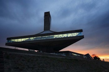
The building named ‘Danube Flower’ was built some thirty-five years ago to become a landmark at Belgrade waterfront. It used to house an exclusive restaurant which was a segment of a larger recreational centre accessible to the public. The project was sponsored by the communist government of the time and endorsed by then ubiquitous president J.B.Tito, who was the first guest at the restaurant on November 22nd 1973. It was a famed hangout spot until its decay in the nineties and its final closure which coincided with the start of the civil war in the country. For the period of fifteen years building was not in operation and has deteriorated considerably.
In many ways the building is particular but above all for its synthesis between architectural and structural reasoning. The main volume of the building, triangular in plan, is elevated some fifteen meters above the river and the ground level with the pedestrian esplanade. It is supported solely by the central core which contains two elevator shafts and double spiral staircase. Cantilevers are reaching out some twelve meters giving a levitating feel to the building. In addition one more structural move is crucial for seamless interaction between exterior and interior of the building. Concrete floor-slab and ceiling shell are not connected at the perimeter of the building, allowing for the continuity of the glass façade to the full extent. Uninterrupted glass strip, with the total length of 150 meters, is wrapping around the building to give constant presence of the Danube River in the interior, with sweeping views reaching far out, both upstream and downstream.
Together with the client organization, already reputed for its high-end gym and spa in the city centre, we have formulated a project brief promoting active lifestyle. We have defined the Sky Wellness concept suggesting that place should be light and spacious so that visitors should be getting an impression of entering a cloud on arrival. In response we have opted for reflective resin floor finishes throughout and semi translucent Barrisol stretched ceiling; both aiming to expose sleek forms of Technogym training equipment in the open plan arrangement.
Originally, building was planed on the grid of 7.3m equilateral triangles which defined its organizational and structural regularity, but with the different brief now we were looking for a change. Defining moment of the new spatial expression is the ceiling. Its design is the sequence of geometric transformations and subdivision applied to the original grid. As a result, approximately 390 backlit panels with the finite variation in shape and size are suspended from the triangular steel construction.
4of7 works in association with London based office " superfusionlab".


