House Lam
Jun 04, 2013Nico van der Meulen Architects
David Ross, Barry Goldman
Johannesburg
Bedfordview
Residential
Wrong or incomplete information? Let us know!
Notes
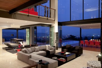
When the client approached Nico van der Meulen Architects, the brief presented was intended to alter and add to an existing 1950’s house and update its design. The first floor had to be designed from scratch to accommodate the bedrooms and the ground floor had to be converted to an exclusively open plan living space. The rocky outcrop inspired the design, which was developed to maximise the surrounding views, making use of the nature feature without compromising the contemporary, flowing aspect of the building. In opposition to the original entrance at the top of the site, the architects created a new access at the lower ground floor of the 3 storey home, with an internal staircase leading up to the ground floor living area. The existing home’s foundations and structure offered an almost 300° view across Johannesburg. This was used as a shell for the new design, which had to optimise views of the city to the West while still being orientated to the North to maximise sunlight. The lower ground floor can be reached by the visitors through the driveway that leads to the main entrance. Proceeding up the staircase to the ground floor, one is met with spectacular views of Johannesburg and its surrounds. The ground floor is an open plan living area with the double volume main living room guiding the guests out onto the lanai and pool. From the kitchen one can give views to both the North and South, while still having direct access to the lanai and dining area. The ground floor living areas were designed around a pool, which is a prominent feature of the house. The spill over detail of this cantilevered pool creates a seamless integration with the views across the city. From the ground floor one can access the first floor bedroom suites and pyjama lounge. A bridge links opposite sides of the main and family bedroom suites. In all the rooms, the view is maximised thanks to the wrap around balconies. M Square Lifestyle Design, captained by Phia van der Meulen, meticulously chose the interior touches that would distinguish this house: a natural wood finish runs through the house, from the pool deck, the bridge on the first floor, the bedroom floors and to the furniture itself. The colours used in the interior gives the home a warm feel. The colour palette within the interior was chosen to compliment the colours that were used in the buildings structural elements and to blend with the walnut wooden floors and stone feature wall. The colours used are neutral tones – grey, white and black – offset by splashes of bright red. The integration of white surfaces and dark natural wood theme runs throughout the house and can be seen with the kitchen counters and the bedrooms and bathrooms. The entire interior is elegantly simple, sleek and modern. The lighting in the interior plays an important role in the interior design. It was creatively placed to create a stylish well-lit core ambience and the use of lighting beautifully illuminates the exterior of the house, so that it stands out against the rocky outcrop in the night sky.


