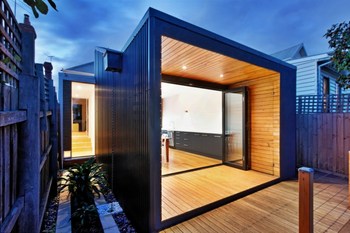
Gardner House
Sep 27, 20114site Architecture
Kevin Hui
2010
Melbourne, Australia
39 sqm
Residential
Website URL
Wrong or incomplete information? Let us know!
Notes
The existing property was typical of an early-20th century worker’s cottage, with a poorly planned series of gloomy, dysfunctional lean-to additions, no access to natural light and no direct connection to the rear yard. It did however provide two amenable bedrooms at the front and a functional, small living area. With this, the client’s brief asked for the re-inclusion of a new bathroom, laundry, kitchen and dining area into a more livable manner.
The difficulties that the site presented consisted in the property’s south-facing orientation, hampering direct solar access and its the limited access to private open space.
In response, the planning logic was to create a compressed centralised service core containing the bathroom and laundry, allowing a higher volume that is the kitchen/dining room to connect to the yard at the rear.
Formally, the addition consists of two elements connected by a small hallway. The first is a white box, containing the new bathroom and laundry; the second being an open plan kitchen and dining area, a black metal clad box which is setback one meter from the boundary and reaches up over the white box for northern sunlight.
Upon entry one is presented with a view through the house to a small courtyard given over by the one meter setback of the addition at the rear. This vista, created by a full height window at the termination of the connecting hallway gives an immediate sense of light and flow through the house. The inclusion of a side timber slot panel also provides the ability to cross-ventilate whilst providing insect screening and security, a simple and economical device that was inspired by the simplicity of 50’s Modernism.
The transition from the existing cottage to the new addition utilises a compression and release effect in the ceiling heights. The high ceilings of the existing cottage transfers to a much lower ceiling through the connecting hallway. This compression is then released again upon entry into the kitchen/dining area. The visual shift amplifies the sense of height and openness and strengthens the delineation between the new and the old.
The kitchen/dining room is a simple shed-like structure, a skillion roof that terminates at its apex with a clerestory window facing north. The use of this highlight window maximises the amount of sunlight, both direct and bounced off the sloping ceiling, giving the new addition a warmth and openness that overcome the constraints of the site.
The continuous laminate kitchen bench element becomes credenza and a small work space with computer, unifying the whole kitchen/dining space as a whole.
The connection to the outside is amplified by the framing of the rear yard by a low, beautifully proportioned timber clad verandah that acts as another compression device before being released to the small backyard beyond.


