Front to Back Infill
Oct 18, 2011Colizza Bruni
Peter Fritz
2008
111 sqm
Residential
Website URL
Wrong or incomplete information? Let us know!
Notes
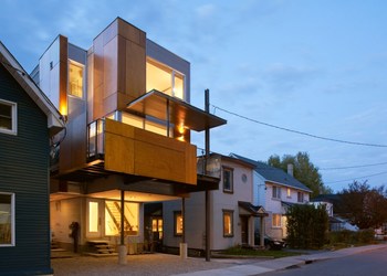
Front to back infill is an animated, front to back semi-detached which boasts two small yet spacious light-filled homes. The design was a collaboration of two architects, each designing one of the homes, and working together to fuse the two designs seamlessly into one another.
The approach was to situate the two homes front to back instead of the traditional side to side.
One home would face the street and engage the public realm, while the other would inhabit the private realm of the rear yard. Each unit is designed to take advantage of its exclusive position on the site resulting in two unique homes with their own distinctive character and personality.
The challenge for this project was to design two small and affordable homes for two separate owners on a narrow 25’ x 80’ lot slotted between existing houses. The new front to back semi allowed each owner to maintain separate ownership and split the land cost to make the project affordable.
The use of economical materials and simple details were essential to developing a contextual design as well as maintaining an economical budget. The site is located on the edge of a proletarian residential neighbourhood and steps from the Parkdale Farmer’s Market in Ottawa’s community of Hintonburg.
The neighbourhood is made up of modest 19th century worker’s houses interspersed with remnants of light industrial buildings which influenced the formal gestures and materiality inspiring a thoughtful dialogue between the semi and its context. Sustainability starts with the decision to design two small compact houses in lieu of one large home. The front to back semi allows for an increase in two new affordable residences in a sustainable community and promotes responsible growth in a compact walkable urban center.
The primary form of the building began as a simple 3 storey box at the rear of the lot (the back unit) with a second box grafted onto the front (the front unit). The front box was raised on stilts to allow for parking and a separate access to the back unit. It was then sculpted and fragmented to reflect the proportions of the existing houses. The two homes were wrapped with metal and plywood inspired by the site’s industrial context. From the ground floor level of the front unit, stairs rise in front of a floor-to-ceiling window and takes you up to the primary living level raised 1 storey above the street. On the main living level, a fully glazed south wall opens onto a large cantilevered terrace providing an interstitial space between the private realm of the house and the public realm of the street.
Sculptural cabinets wrap the living space, sinking down to act as a low commode as they pass the dining area, then morph seamlessly into the raised hearth of the minimalist fireplace box. Sheets of transparent glass separate the stairs (both entry and upper) allowing light from the third floor skylight to wash the walls and enliven the space. The rear unit celebrates the integrity of its 3 storey box with a dramatic double volume space that connects the kitchen and dining area on the first floor with the living room mezzanine on the second floor to make one continuous and playful space with visual connections and multiple vantage points. Large windows fill the double volume space allowing substantial northwest light to animate the space with multiple shadows on the sculptural white walls. Simple cantilevered maple stairs connect the three levels of the home behind an elegant metal veil that subtly screens the stair from the rest of the house. The room focusing minimalist firebox in the mezzanine rests on a raised concrete hearth maintaining the textures and materiality of the kitchen below. The front to back infill is a unique concept for the traditional semi-detached home and an innovative way to increase density on a narrow infill lot.


