Ferrari Factory Store
Nov 03, 2011Iosa Ghini Associates
Gianluca Grassano
Alessandria, Italy
370 sqm
Commercial
Website URL
Wrong or incomplete information? Let us know!
Notes
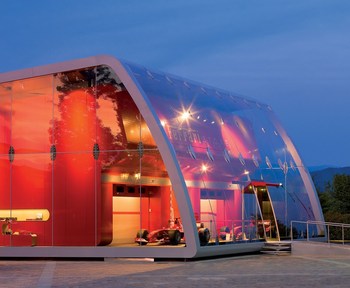
Ferrari Factory Store of Serravalle Scrivia, entirely designed by Iosa Ghini Associates, is located outside McArthur Glen Outlet in Serravalle Scrivia. For the first time in the history of Ferrari Stores an entire building has been designed to accommodate the store. The building enjoys a privileged position as one of the first structures of the Outlet visible from the main parking area and access roads, for this reason it was designed with an exterior that immediately identifies it at "Ferrari space".
The building of approximately 370 sqm is characterized by a large glass gallery that recalls the image and feel of Formula One box, immediately projecting visitors in the Ferrari world.
From a technical point of view the glass gallery is highly innovative with a curved face without mounting posts and bars that permit total visibility inward and outward. The curved glass panels are assembled using a frameless anchor system, i.e. without mounting supports but with ultra light and clips that guarantees the perception of material continuity between the plate glasses and provides lightness to the whole system.
Climate control of the glass gallery is effected by a system of air circulation that takes advantage of the motion of air convection, allowing for the passive cooling by natural induction. This natural system is supported by a forced air system that may be activated when climate conditions require it. In addition, the exterior glass envelope is treated with special UV protection films as well as a screen prints that reduces sun rays for energy savings as required by national standards for the sector.
Beyond the glass gallery there is the commercial space. As in all Ferrari Stores the merchandise areas are: the zone for Ferrari fans is designed with aluminium slats of high flexibility, in the luxury zone the display windows use soft materials, brushed leather and polished lacquer, in the children’s zone both systems are integrated : slats and display windows finished in yellow lacquer. A shaped false ceiling outlines the design of the ensemble and follows the path of visitors. The design of the areas is tightly connected to the design and graphic project specific to each Ferrari Store.
The graphic style is integral part of the project, in a personal vision of Iosa Ghini Associates of the architectural space, where the three dimensions meet to obtain an encompassing area able to capture all senses, to transmit an engaging idea through a physical and iconographic interpretation.


