GT Tower East
Jun 22, 2011ArchitectenConsort
Unknown
February 2011
Seocho-dong, Seocho-gu, Seoul, South Korea
Gross Floor Area – 54853 sqm, Site Area – 4033 sqm
Mixed use
Website URL
Wrong or incomplete information? Let us know!
Notes
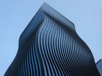
In Seoul, South Korea, the remarkable office tower GT Tower East, has been inaugurated. Designed by the Dutch architectural firm ArchitectenConsort, based in Rotterdam, GT Tower East will form an architectural unit with the GT Tower West, yet to be built. With its elegantly undulating glass facade, the new high-rise brings a fascinating change to the angular architecture of the Korean capital.
The form and positioning of the 130-metre-high building are the impressive result of the vision of architects Peter Couwenbergh and Edgar Bosman of ArchitectenConsort. They chose a uniform, glass finish for the facade, which has resulted in an organically pure form. The undulating motion of the facades provides an optically changing primary form when passing the building. Combined with the reflection of the light in the glass, this gives the building a special, iconic appearance. The dynamic appearance of GT Tower East is reinforced by the sight of the building, that seems to be dropping down below street level. As it were the building rises out of the Korean soil and then reaches upwards in a dancing movement, up into the infinity of the sky.
Ready for a sustainable future
Within its gross 54,000 m2 of floor space, GT Tower East fulfills a range of purposes.
In addition to functional office spaces, there is room for commercial and cultural uses, as well as parking. ArchitectenConsort used a flexible base plan, thereby responding to the increasing demand for buildings that retain their value over time. The architects achieved the high adaptive capacity of GT Tower East by placing the compact core at the heart of the floor plan and using a carefully thought-out column structure. These measures ensure that the facade remains entirely unencumbered, and large floor spaces are created that allow the building to accommodate a variety of uses in the future. Many sustainability measures were integrated into the design, including a well-insulated facade, the installation of solar panels for generating power, and a lot of natural light and ventilation to create a pleasant working environment.
Study of glass facade with wave motion
The Rotterdam architects carried out an extensive preliminary investigation into the construction of the glass facade and the wave motion effect. The motion effect of the volume has been achieved by shifting the floor areas along one of the two diagonals by a maximum of three metres. This shift occurs two-and-a-half times over the total height of the building, so that each wave has a height of 48 metres. The advantage of this design is that the columns are placed right above each other and the cantilever can be achieved just with extra reinforcing within the same floor dimensioning. In addition, the facade construction could be completed without any fittings, because all facades move in parallel. So as not to break up the vertical lines of the facade by interrupting horizontal segmentation, the architects compressed the ceilings towards the outer facade to the size of a window frame. Using this method, the installation of closed or opaque glass panels behind the facade is avoided, which benefits both the interior as well as the exterior appearance. The pattern and dimensioning chosen for the black vertical window frames ensures a subtle balance with the semi-reflective blue glass panels. The window frames also accentuate the form, emphasizing the infinite upward movement.
Entry area and interior
In contrast with the surrounding buildings, the GT Tower East has been offset from the building line. In this way, the designers managed to create a new urban space, which is utilised below street level for the construction of an attractive, submerged outdoor area. This so-called ‘sunken plaza’, provides visitors with a shelter from wind and street noise, and is a pleasant environment to relax, with access to shops and restaurants. In the entrance area at ground level, the vertical interplay of lines of the tower is cut by a horizontal awning and brings back the human scale. Together with the high degree of transparency this makes the entrance very accessible. The feeling is enhanced by the natural stone tiles of the sidewalk, which continue into the lobby in a banded pattern. The design of ArchitectenConsort is also recognisable in the interior. The central lobby and the commercial lobby each have their own individual character, but are unmistakably connected. Direct and indirect light is used to emphasize the experience of the various uses for the building. In the interior, light plays an important role, not just as a light source, but also as a decorative element.


